Menu

MENU

Granny's catering

Lean UX

Web Design

This is a very special project for me. In honor of my grandmother.

One day, Oliver and Sophia were tidying up their grandmother’s home, when suddenly they found a recipe book. The granny’s book was full of recipes and anecdotes about her life. At that moment, they decided that granny’s meals cannot be forgotten, all the love and taste that they have for their simplicity. Thus, how their catering was born, with the main goal to keep alive the stories and food of the grandmothers, combining them with current trends.

Let’s enjoy good food and memories!

This is the story of how Granny’s Catering began. In this article, I am going to explain, from an UX/UI Designer’s perspective, the way that the catering is founded as a startup in just 5 days and I am going to rely on Jeff Gothelf & Josh Seiden’s definition of Lean UX.

I am very excited with this project because I love testing new methodologies and cooking is one of my favorite hobbies!

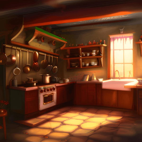
Besides being UX/UI Designer, I have a great cooking passion. This interest encouraged me to think about how it would be to work in this profession.

If we analyze the social media shared on the most current social networks (such as, Tiktok, Instagram, Youtube or Facebook) we can see that food contents are always trending, such as recipes and places to visit. Therefore, food continues to attract people’s attention and we can earn more money by combining food passion with new technologies. Thus, how emerge our online catering, our Minimum Viable Product.

What makes granny's catering a different service from other catering companies?

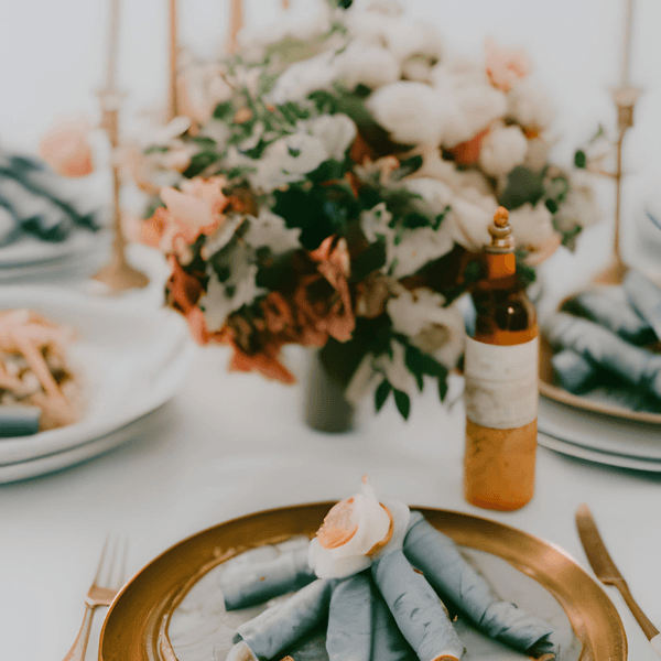
In this catering, we offer the facility to make reservations 24 hours a day. In addition, we incorporate the option of being able to prepare express catering. They are catering experiences that can be organized even 24 hours before the event and you must reserve an event of at least 20 people.

These ideas arise from the current necessity to organize big celebrations, which we might have forgotten or that there have been planned unexpectedly, in a short time.

In addition, Granny’s catering offers quality products and pre-selected packages for different events (such as weddings or birthdays). We take care every moment of the products’ quality and the on-time delivery.

Another focus of this catering is the support of gender equalities at the exporting countries. We demand a 50% female workforce. In this manner, we are offering women the opportunity to gain more voice and power.

Our catering is developed for a public that can afford the prices and, simultaneously, they need our exclusive express service. So, our target audiences have to be between 25 and 50 years of age, with an average socioeconomic and culture level.

Moreover, Granny’s Catering goes further by offering services to companies and supporting diversity allows clients to customize any event. We can afford customers freedom because our long partners list allows us to organize any events. Even at theme parks with only 24 hours advance!

I know it's a very crazy idea. I got it when I saw that lots of times I wanted to set up elegant birthday parties for adults, but it's very difficult to organize it in a short time

Granny's Catering Landing page
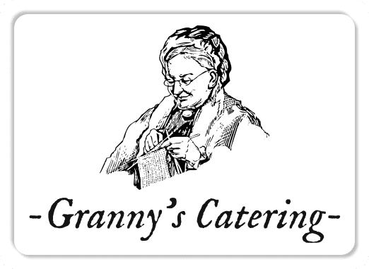
Logo

Without a doubt, the logo maintains what was said before, a simple and clear style. The iconography of a grandmother knitting is an image which wants to be tender and close. Grannies always care about us and they do everything they can to help us to smile.


The text gives a clear idea of what the business is about. The font selected is IM FELL English Italic because it is quite intelligible, moreover, the spellings have a certain inclination and a finishing that is not entirely complete. It may remind us of the ancient manuscripts which were characterized by precious and fully understandable handwriting.

Granny's website

On a first look, we can appreciate a simple, clean and minimalist style. The white is the primary color of the website because it means calm and peace. While, the orange is the secondary color and it is used in different variants. We have chosen this shiny colours because we want to convey the warmth and love of grandmothers’ meals. The warmth which cheers us up to keep enjoying more time with them while we delight with such a tasty food cooked with all their love.

The first frame is clear of what the business it is about, at the same time, it has two icons on the right which allows the users the possibility to search on the web and consult the shopping already selected. Meanwhile, it has a carrusel about some of the events that the catering has organized.

Moreover, there is a drop-down menu, on the left, which the users can find information about events, the company, their shop and how to contact them. With this menu, we seek to achieve customer loyalty because we want them to keep using our services. Also, we do not want to offer many options, following Hick’s law. That is why, to get any specific information they just have to click on the menu.

All the web has a clear text and in the first frame the users can get the main idea of the catering business (the events and their work schedule). The main font of the website is DM Sans because It is a clear round typography which is easy to read. At the same time it has a minimalist and modern style which remind us of current fonts, such as Roboto that Android uses on its devices. On this way, we use the font DM Sans to unite the simplicity of grandmothers’ dishes with current modernities.

On the rest of the website, the information is more precisely and it indicates the type of service offered by the catering and the measures it follows. In fact, these measures are accompanied by icons that are representative and describe very well the information indicated below (such as, Covid-free spaces).


Finally, Granny’s catering website offers a clear summary of the contact information, the social networks through which to find out the updates of the web and the catering hours.

On a first look, we can appreciate a simple, clean and minimalist style. The white is the primary color of the website because it means calm and peace. While, the orange is the secondary color and it is used in different variants. We have chosen this shiny colours because we want to convey the warmth and love of grandmothers’ meals. The warmth which cheers us up to keep enjoying more time with them while we delight with such a tasty food cooked with all their love.

The first frame is clear of what the business it is about, at the same time, it has two icons on the right which allows the users the possibility to search on the web and consult the shopping already selected. Meanwhile, it has a carrusel about some of the events that the catering has organized.

Moreover, there is a drop-down menu, on the left, which the users can find information about events, the company, their shop and how to contact them. With this menu, we seek to achieve customer loyalty because we want them to keep using our services. Also, we do not want to offer many options, following Hick’s law. That is why, to get any specific information they just have to click on the menu.

All the web has a clear text and in the first frame the users can get the main idea of the catering business (the events and their work schedule).

kpis

We will achieve all this through tools that allow us to analyze and monitor web use (such as Google Analytics).

The main font of the website is DM Sans because It is a clear round typography which is easy to read. At the same time it has a minimalist and modern style which remind us of current fonts, such as Roboto that Android uses on its devices. On this way, we use the font DM Sans to unite the simplicity of grandmothers’ dishes with current modernities.


On the rest of the website, the information is more precisely and it indicates the type of service offered by the catering and the measures it follows. In fact, these measures are accompanied by icons that are representative and describe very well the information indicated below (such as, Covid-free spaces).


Finally, Granny’s catering website offers a clear summary of the contact information, the social networks through which to find out the updates of the web and the catering hours.

kpis

We will achieve all this through tools that allow us to analyze and monitor web use (such as Google Analytics).