Woodland: a new Beginning is possible
Design Sprint
App Design
Teamwork
This is my first UX/UI project and I have changed and learned so much since I developed it. I feel so happy to share it with you because it has been my base to be the designer that I am right now.
Design Sprint is a methodology developed by Jake Knapp (2016) at his book Sprint. What characterizes this design is the time that it takes, just five days of your time

DAY 1 - Map
Sprint questions
User persona
Affinity Diagram
Dot-voting
DAY 2 - sketch
Lightning Demo
Dot-voting
Sketch in 4 steps
Crazy 8
DAY 3 - Decide
Wireframing
Dot-voting
Storyboard
DAY 4 - prototype
DAY 5 - testing
To start with the Design Sprint, as any other collaborative methodology, we have to think about the wicked problem or necessity that needs a solution:
How can we contribute technologically to prevent fires at woods and try to reforest them?
The name "wicked problem" is so funny and gives us a clear meaning of the seriousness of the need. It is a social or cultural problem that’s difficult or impossible to solve because of its complex and interconnected nature.
Day 1: what an adventure
Sprint questions
There are a lot of diverse questions that don't leave the principal topic, that is why come up the sprint questions, to help to guide the solutions you discuss and the decisions you make. They will help us to have a first contact with the main problem.
A little trick that I learned was that, to have a better communication and keep our work in order Miro is such a good solution. Why? Because it is a free online application in which each member can edit and express his ideas with a specific color that identify him/her and without collapsing the program.
User persona
As soon as we ended up the brainstorming we did a User persona because can help us to get closer to the user and think about good designs which can solve their need.
Affinity Diagram
After ending the last two steps we decide to keep a good order classifying into affinity diagrams or general categories, the resulting ideas.
Dot-voting
This technique help us to decide democratically which will be the specific problems that we were going to solve. We just have to individually vote on the ideas, specific features of each design and features with great usability; using colored dots.
The final result was the question:
How could we economically incentivize users when they warn or detect fire risk?

Day 2: this is so fun!
We were at the point that we had to start to think of solutions to reach a high fidelity solution, that is why we decided to try the following techniques:

Lightning demos
In this technique, first, we have to do a research individually (for 25 minutes) of different ideas for our website or application. After this, we share our ideas and dot-vote again the new designs (for 20 minutes). The design with more dots will be the base for the inspiration of the application or website that we will design individually.
I have to say that at first my designs were so basic an similar to sketches, but it did not stop me to be very motivated to develop my own solution for this problem, basing on the limits set.
Sketch in 4 steps
First, we take notes of objectives, opportunities and inspirations of the idea that we have in mind (20 minutes). Then, we take 20 minutes to draw random ideas. It doesn’t care if the ideas are incompleted or disorganized.
Crazy 8
This is crazy technical but it's so much fun. You only have 8 minutes for create 8 solutions. 1 solution per minute.
Day 3: We are very close to a final high fidelity design!
Wireframing
After all these solution techniques we did some wireframes or low fidelity design of our application. Then, we did again, a dot-vote of the best wireframes,which will be the ones we rely on to develop the high fidelity design. In this way, we answered the question "How could we economically incentivize users when they warn or detect fire risk?" with the final answer:
Recycling in brand containers and participating in ecology work. Thus, users get points to win prizes and discounts.
storyboard
Finally, the last task that we did in group is a storyboard. To this end, we selected one of our users developed on the User Persona. This storyboard helped us to appreciate that our application or website could be useful and how it would work.
Day 4: Manuel & the final product
I developed the high fidelity design through some quick wireframes that I did on the same day, and based on the idea that we had defined as a group.

I was very happy to see that I had managed to carry out the idea I had in my head, getting a working prototype that I could even use to test with some users.
Day 5: On time!
The testing phase was carried out with three people aged 22, 24 and 50. And we are going to analyze the high fidelity design considering the result of the testing.
First of all, the principal color of the app is the black because it is related with rubbish and pollution.
The first image is the home screen of my application, called “Woodlands”. It has three errors that I should solve in the next updated:
The dropdown menu: it isn’t useful to have a drop down in an app with such a few tabs (ecology works, discounts and shop).
The icon which lets the users to see how many coins he has needs to be clear because not everybody understand it function and meaning.
The videogame is not already developed and maybe it is not necessary for this app.
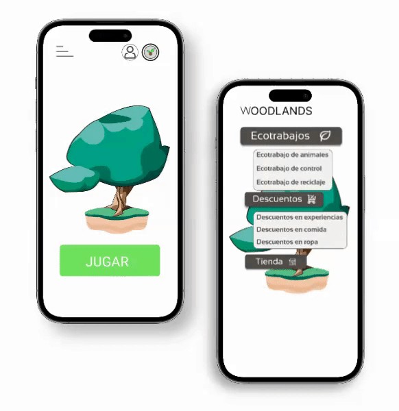
I have sought to achieve a greater affinity with applications that people use daily, for this reason, both the user tab, as well as the one for discounts and ecological jobs, have a design similar to WhatsApp.
The Profile tabs: on it the users can modify and access to their profile photo, nickname, mail and user code.
The Discount & Eco-works tabs: a good point to consider on these tabs its that the three types of works and discounts are accessible at first look for the users.
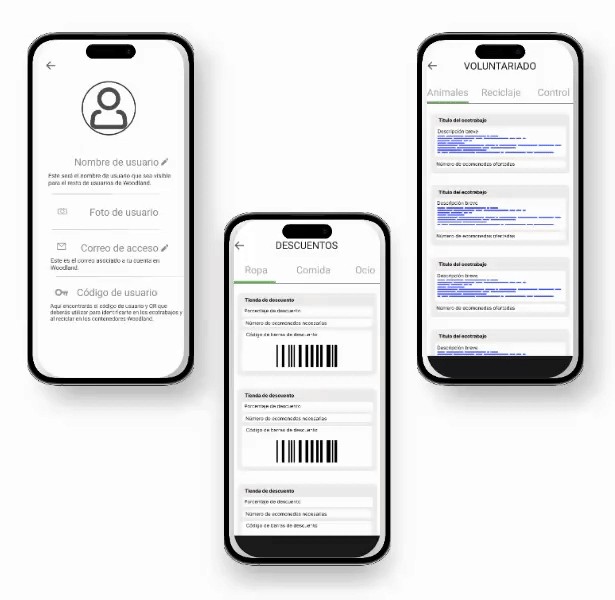
Updaiting Woodland's app
Finally, applying all the changes that we have mentioned this is the final result:
As we can see, the home tab has been modify, now the menus are more accessible and they are represented with icons that are easy to relate with them.
Another big change is that the coins have passed to be on the profile menu. The reason is because this helps the users to have at the home screen just the priority information.
The shop tab has been a big update because now we can see how it will be. It keeps the colors of the brand, and it has different products that the user can buy with Woodlands coins.

I'm very happy with what this project means to me. When I did it in September 2022 I didn't know much of what I know now. The final result that I have achieved five months later motivates me to want to continue learning more and to value my work achieved.
Manuel's Portfolio
About
Blog
Resume
Connect